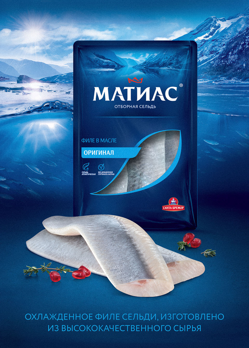
Herring doesn’t photograph itself. Unlike a burger or a dessert, there’s no inherent geometry to lean on — the appeal is entirely in the surface: the sheen of the fillet, the softness of the flesh, the suggestion of cold brine. Get the lighting wrong by a few degrees and it looks either dull or unpleasantly wet.
For Santa Bremor, the brief via PG Reforming covered point-of-sale materials, print booklets, posters, and digital — meaning the key visual had to work across formats with very different viewing distances and colour profiles.
Every surface detail was managed to keep the texture reading as fresh rather than processed. Lighting was built to pull out the natural sheen without flattening the fillet’s structure. Files were prepared and retouched for each deployment format individually.
This project sits within our broader advertising food photography work for FMCG brands. See also: Santa Bremor Dubai Ice Cream, Mishutka key visual, Danissimo OOH.
Client BREMOR
Agency PG REFORMING
Food Stylist Evgeny Makarevich
Post Dmitry Zyablitsev
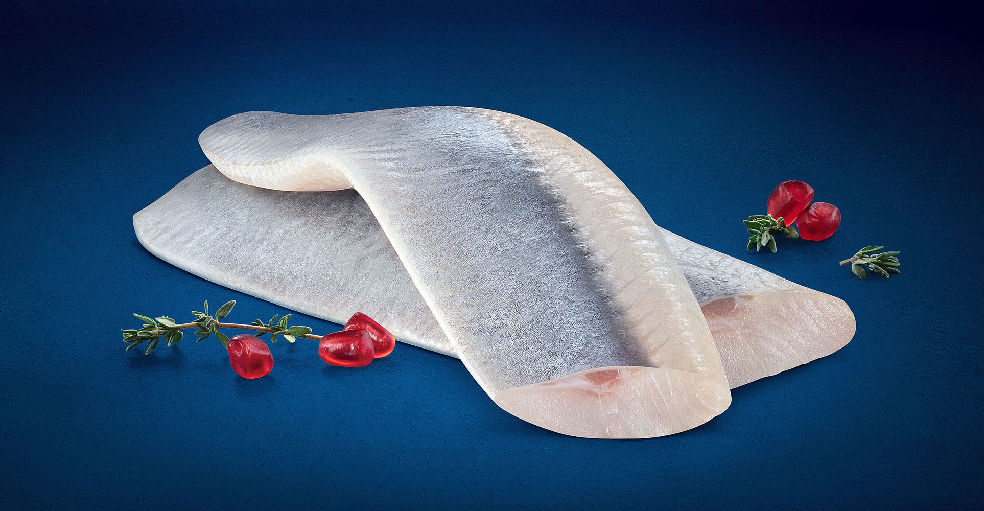